Taylors Single Harvest 1961
Year
2022
Scope of Work
Product and Packaging Design
Location
Portugal
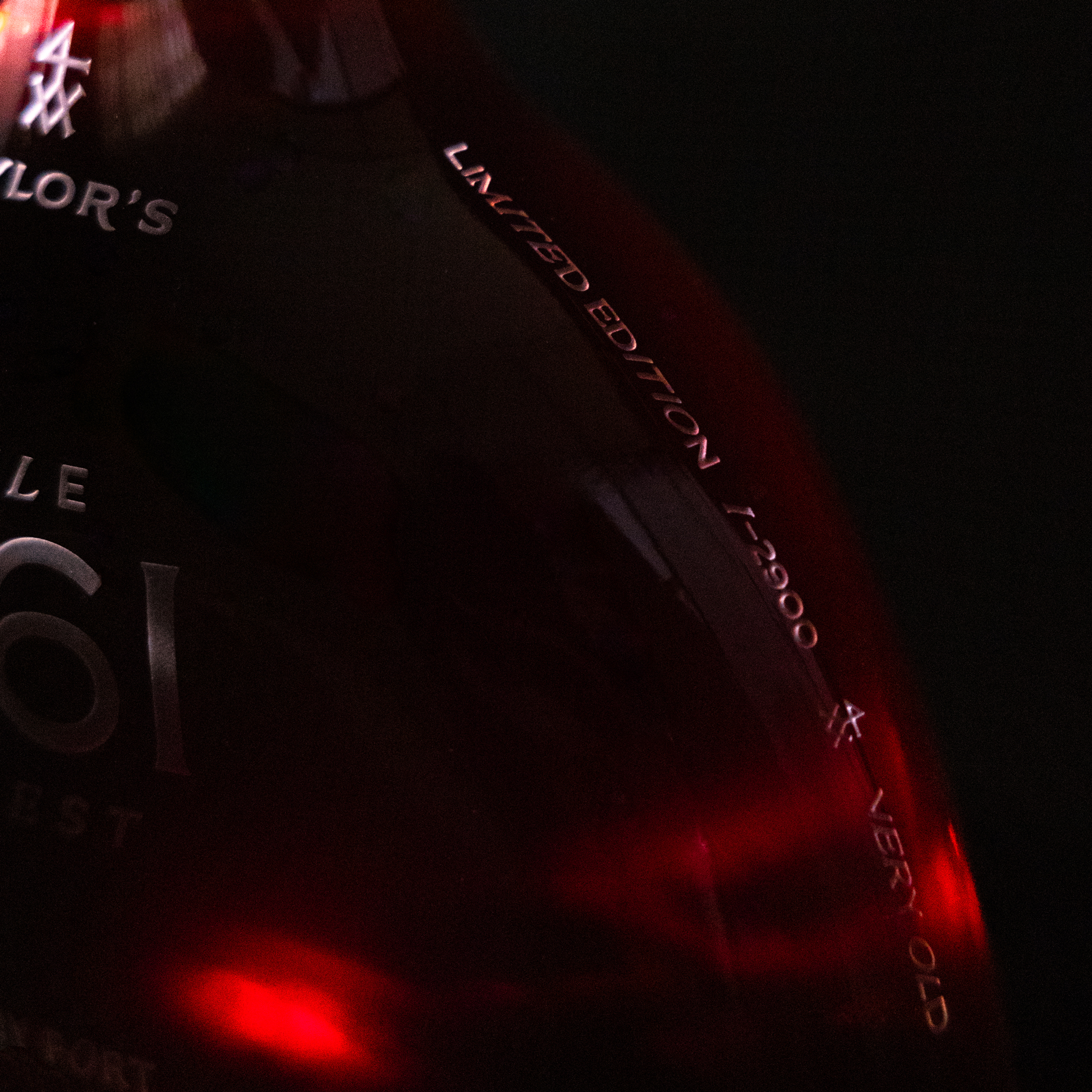
Taylor's has substantial stocks of aged Tawny Ports, and their latest range is the Single Harvest 1961. These extraordinary wines age smoothly in Taylor's cellars in Vila Nova de Gaia, where conditions are ideal for the wines to slowly develop the rich and complex aromas that are characteristic of very old Ports. The 1960s are known as the "Rebel" years due to the cultural and ideological changes of the time. It is also a decade full of memorable wines that are almost impossible to find nowadays. The project involves a redesign of an existing limited-edition bottle. The choice of typography in this project was significant, as the idea was always to connect the past with the present. A serif font was chosen to symbolize the past, while a non-serif font was chosen to symbolize the present. As this is a limited edition bottle, the appearance of both the bottle and packaging had to coincide. The choice of the bottle was also carefully considered, as it is meant to resemble the view of the vineyards from above. After selecting the bottle, a low relief engraving of the label was made directly onto the glass, giving it a more premium finish. The packaging was designed to resemble a frame, where the bottle would be an exhibited piece.